Overview
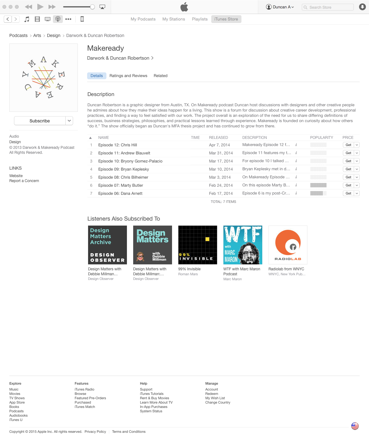
As an MFA thesis project, Duncan Robertson developed a podcast titled Makeready, featuring conversations with designers about how they reached a point in their careers where they feel satisfied with their work and client relationships. Makeready explores the need for designers to share their backstories, business strategies, philosophies, and practical lessons learned through experience. Each conversation focuses on the preparations and milestones that helped designers find and define success.
Project Brief
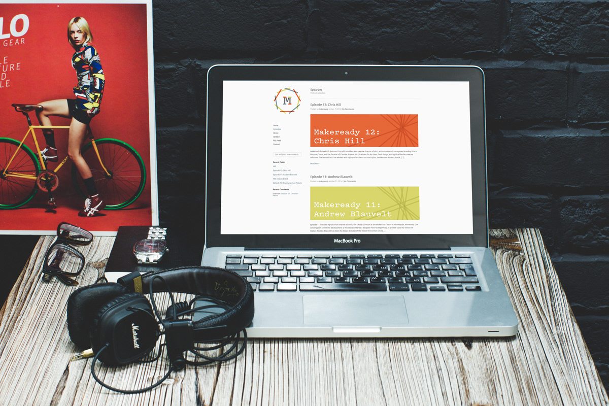
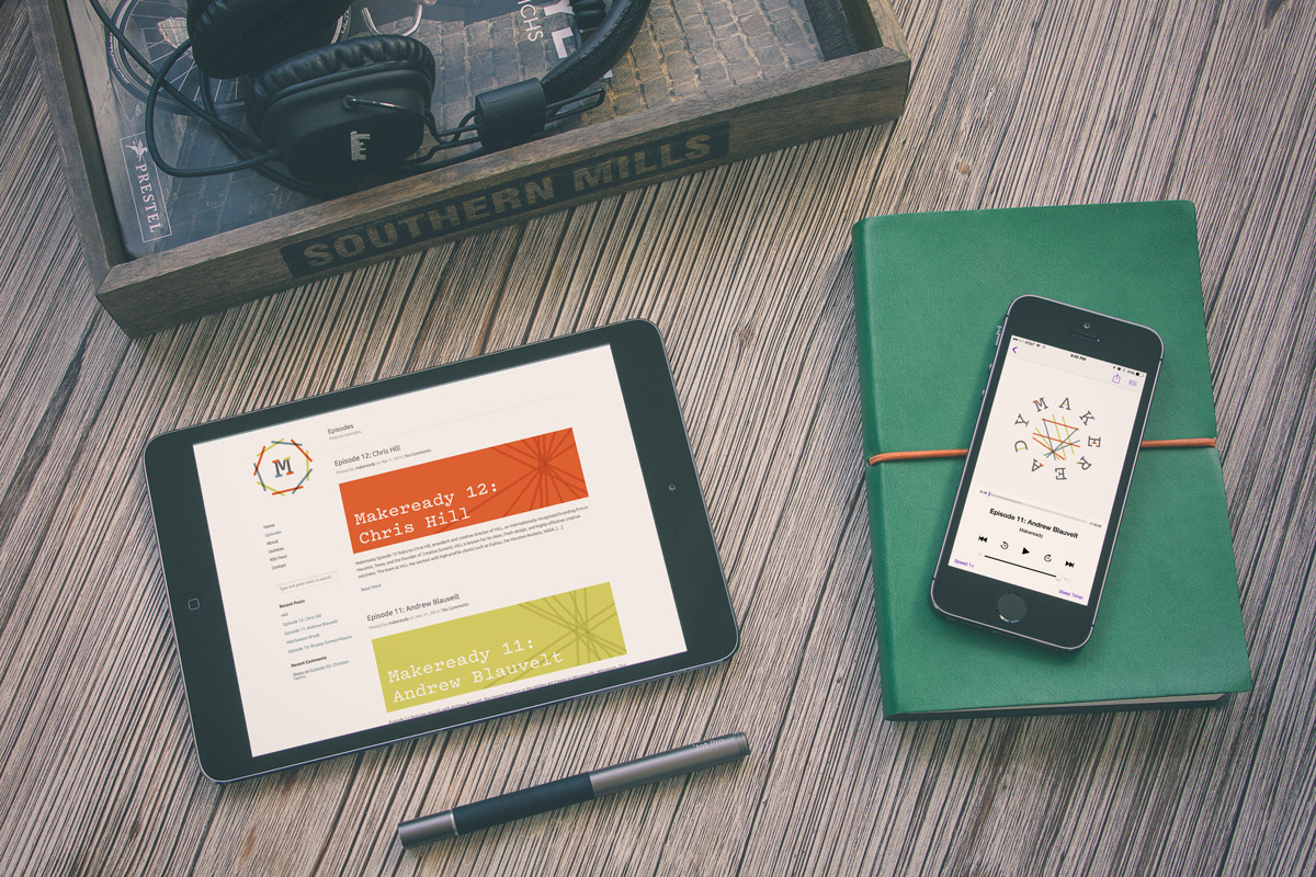
For the project to succeed, Makeready needed: an identity which communicated the intent and the character of the podcast; an easy to navigate website that allowed listeners to discover episodes and permitted room for growth; in addition to collateral items with original designs for promotional purposes, and thank you gifts for podcast participants.
Outcome
Makeready launched in January 2014 with a gallery exhibition at Texas State University, and with rave reviews from some of the world’s most-acclaimed designers. Makeready continues to develop as a “real world” project.
Feedback
“Your podcast is GREAT! Congratulations.” —Debbie Millman of Design Matters
“Keep up the great work.” —Christian Helms of Helms Workshop
“i know what i will be doing this weekend.” —Rick Valicenti of 3rst
“Keep up the great work.” —Christian Helms of Helms Workshop
“i know what i will be doing this weekend.” —Rick Valicenti of 3rst
Logotype
The logotype integrates the concept behind the logo into the podcast name by applying the same generative formula used for the "pickup sticks." This is a purely typographic representation of the brand for use when the main logo format does not work as well in application.
Typography
Pitch was chosen for many reasons. The basic design is based on classic typewriter letters. Typewriters have a legacy of functionality, romance, and literary seriousness, which aligns well with Makeready's goals. Like a podcast, the letters require very little formatting or typographic styling. Pitch is a humble, beautiful object that represents Makeready's earnest motives.
A system was developed in which the lines bounced around irregularly and avoided collisions with the letters. The formula is based on a nine-sided shape and nine lines used to create a crisscrossing design. I created eight drawings by extending lines from one point to another point a certain number of spaces away. The simple formula generated seemingly random shapes. For the first composition, I took line one from the first shape, line two from the second shape, line three from the third shape, and so on. Nine lines were chosen in rotation until the shapes started repeating. 90 unique shapes were generated.
Next, the connection between the type and the intersecting lines was lost when the lines no longer ran between the letters, and the pathways seemed too finite when they terminated with round endings.
Pitch—a slab serif, monospace font—was chosen to make a stronger connection between the letter shapes and the generative lines. The monospace design also helps relieve tension in the rhythm between letters when they are evenly spaced around the nine-sided shape.
I adjusted the intersecting-line portion of the logo to make the pathways feel more open-ended and return to the crisscrossing feel. I applied a generative formula to the letter serifs to tie the letters to the overall concept and customize the font in a way that makes it unique to this logo.