WTW Software Design System

Building a design system that could work across WTW’s software products.
Willis Towers Watson (WTW) needed a software design system that could bring greater consistency to its digital products while accommodating the different needs of the teams building them.
At Monigle, I helped turn that need into a new kind of client engagement for our digital creative team. I developed the initial approach, led the proposal, and provided design direction as our team built a comprehensive system of components, patterns, and guidelines.
The project became an important step in expanding Monigle’s digital capabilities beyond the supporting materials we traditionally produced during brand engagements.
Project details
Client: Willis Towers Watson (WTW)
Organization: Monigle
My role: Senior Director, Digital Experience Design
Duration: Nine months
Deliverables: Design system, Figma component library, documentation in Zeroheight, and coded components developed by WTW’s engineering partner
A missing piece in our digital offering
Monigle had an established approach to translating brand identities into digital experiences. It was useful work, but I increasingly felt we were missing an opportunity to create something more substantial.
Our brand teams developed comprehensive systems for expressing a client’s identity. On the digital side, we often produced supporting guidelines and examples without establishing the same depth of reusable infrastructure.
I had begun exploring whether software design systems could become a core part of Monigle’s digital offering.
Around the same time, Nicole Boysen was completing the digital work for WTW’s rebrand. That work had been successful, and WTW was beginning to look for outside help with its software design system after an earlier internal effort hadn’t produced the result they needed.
Nicole and I regularly discussed how to develop our digital services. When she heard me talking about design systems, she recognized the connection to WTW’s needs and brought the idea to Katie Cisto, WTW’s UX lead.
Katie invited us to submit a proposal.
I took responsibility for defining the offering, developing the scope and approach, and presenting our proposal. We won the engagement, giving Monigle an opportunity to deliver its first comprehensive software design system for a client.
We’d explored this work internally through Beam, but this was an opportunity to establish it as a client service.
The system established shared principles for consistency, accessibility, and reusable design, along with guidance for working within different product and technical constraints. Click the image to see design principles on the live WTW Software Design System Site.
Consistency without forcing everything to be the same
WTW had multiple teams building different kinds of software products. Some supported information-dense workflows, while others needed more space for content, guidance, and interaction.
The organization had already attempted to establish a shared design system internally. One challenge was creating something teams could use without immediately developing their own variations.
We needed to understand where consistency mattered and where flexibility was necessary.
Nicole and I conducted stakeholder interviews with designers and developers across WTW, including teams in the United States and Europe. We used those conversations to understand their workflows, technical constraints, and product differences.
The goal wasn’t simply to establish a consistent visual language. It was to create a system that could accommodate those differences while still giving teams a common foundation.

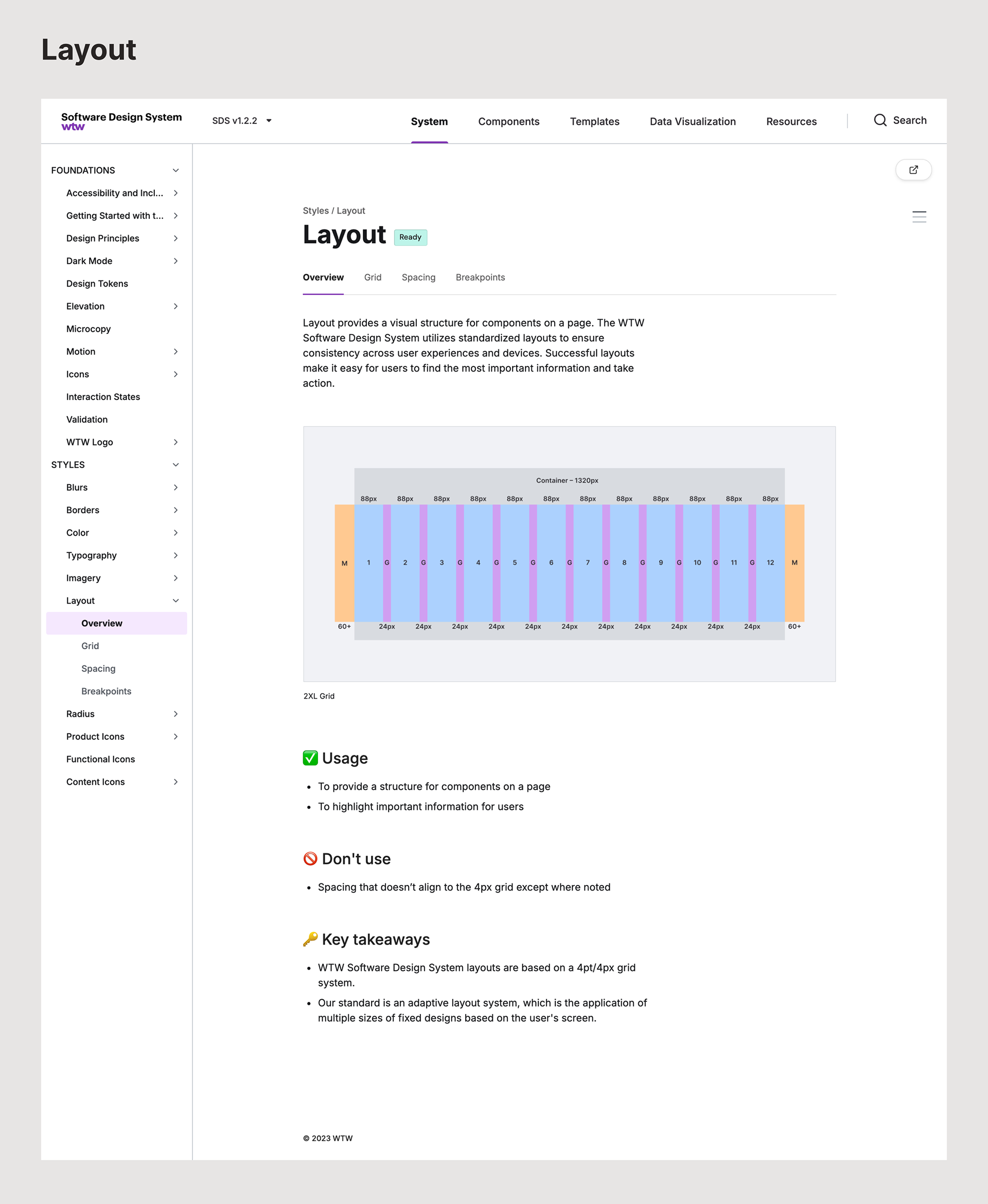
Shared layout guidelines gave WTW’s product teams a consistent foundation for organizing content and interfaces across applications. Click the image to see Layout on the live WTW Software Design System Site.
Making room for different product needs
Two decisions stand out to me from the work.
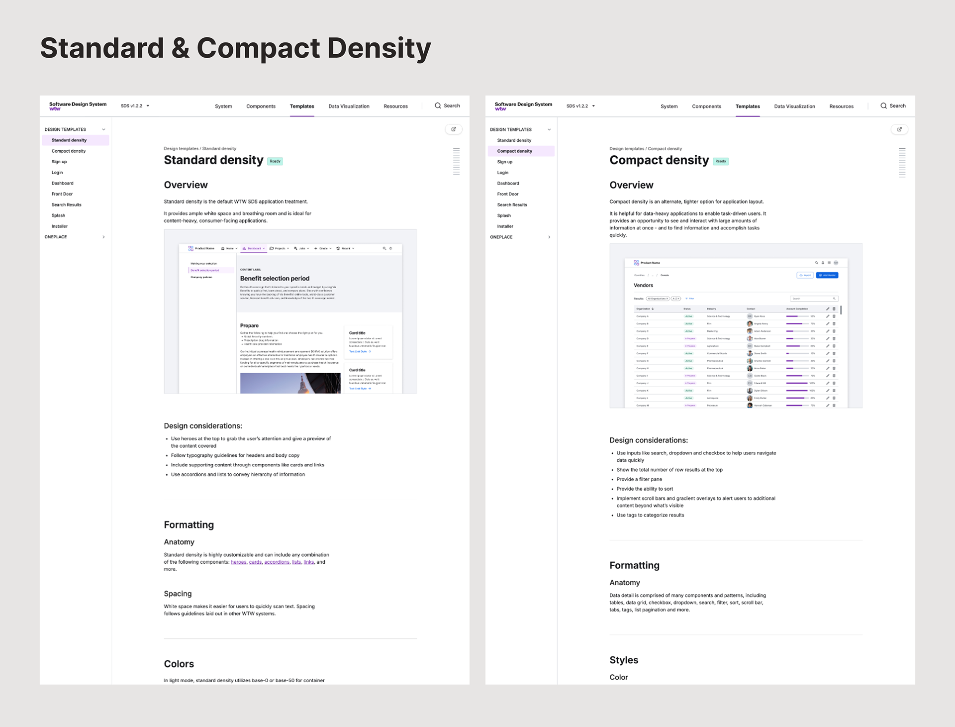
Standard and compact density
Some WTW applications needed to display large amounts of information in relatively small spaces. Others could use more generous spacing and larger interface elements.
Rather than force every application into the same layout density, the team developed guidance for standard and compact experiences.
This allowed products to respond to their users’ needs while maintaining a consistent underlying design language.
It was a useful lesson in what a design system needs to do: establish shared decisions without pretending every product has identical requirements.

Standard and compact density options allowed WTW teams to support different application needs while working within a shared design system. Click the image to see Standard and Compact Density on the live WTW Software Design System Site.

A more flexible typographic hierarchy
We also spent time working through the system’s typographic hierarchy.
Our initial direction drew on more traditional typographic approaches, using a limited number of font weights to establish hierarchy. It didn’t give us the clarity or refinement we wanted, especially at smaller interface sizes.
I remembered an article I’d read about using a broader range of font weights to create more nuanced hierarchy. I shared it with Nicole and Katie, and we explored how the idea might work within WTW’s type system.
Using intermediate weights helped us create more gradual transitions between levels of information and improve legibility in dense interfaces.
It’s a detail I still appreciate because it came from questioning an established convention rather than accepting the first approach.

The typographic system used a broader range of font weights to establish clearer, more nuanced hierarchy across WTW’s software interfaces.​​​​​​​ Click on the image to see typography scale details on the live WTW Software Design System site.
Turning the design into something teams could use
Nicole led the day-to-day design work and created the majority of the system’s components and documentation. My role was to provide direction, help resolve questions, and support the team as the work developed.
The system brought together reusable components, interaction patterns, design principles, visual foundations, and implementation guidance.
We used Figma for the design assets and Zeroheight to organize and publish the documentation. WTW also engaged Overlap, a development agency, to implement the coded components.
Late in the project, Nicole went on maternity leave, and I stepped into her role to oversee the remaining work.
A significant part of that final phase involved reviewing the coded components against the designs. Getting the implementation to match the intended details required more attention than we’d anticipated, but we worked through the differences with the development team.
We also made adjustments to the original scope as we learned more about the effort involved. Some planned work was transferred to WTW’s internal team, allowing us to complete the engagement within the agreed timeline and budget.

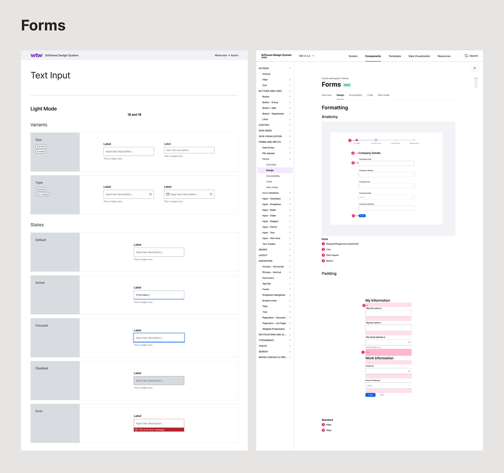
Component variants and interaction states in Figma, alongside the corresponding documentation published in Zeroheight. Click the image to view the components on the live WTW Software Design System Site.
A foundation the teams were ready to use
We delivered a documented software design system supported by Figma assets and coded components.
When we presented the completed work to WTW, Katie was pleased with the result, and the teams we’d been working to support responded positively to the solutions we’d developed.
That reception meant a lot to me. We’d spent considerable time understanding why the earlier effort hadn’t worked as intended and ensuring this system could accommodate different teams' needs.
For Monigle, the project also showed that software design systems could be a substantial digital offering in their own right, not just an extension of a traditional brand guidelines project.
There were lessons for future engagements, particularly around scoping, anticipating the effort required for component documentation and implementation QA, and structuring the work in more manageable phases.
But the larger lesson stayed with me: a useful design system needs enough structure to create consistency and enough flexibility to work in the environments where people actually use it.
That thinking later influenced how I approached the Fringe Product Design System.

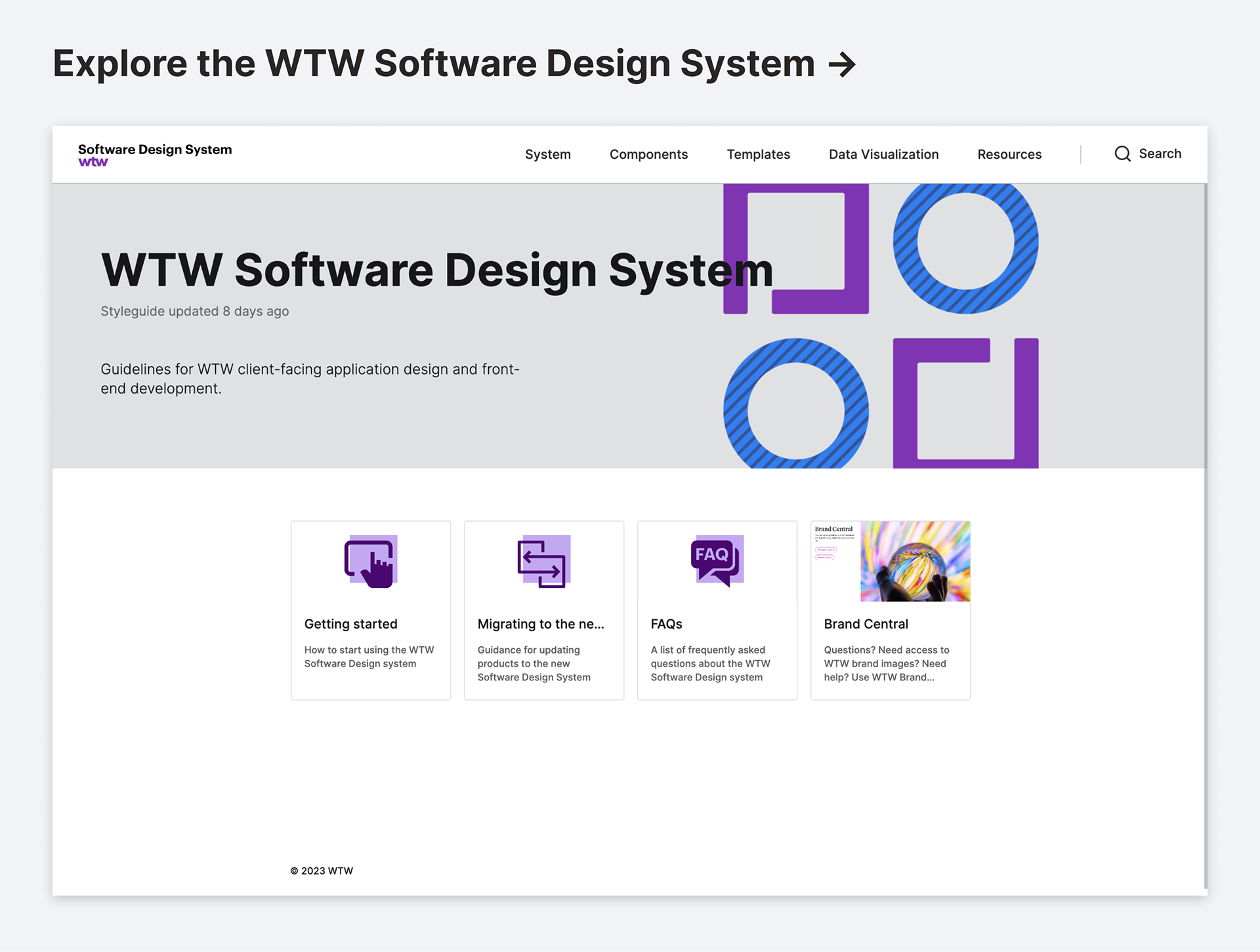
The completed WTW Software Design System brings together design principles, reusable components, and implementation guidance in a shared resource for WTW’s product teams. Click the image to explore the published system.

You may also like

↑Back to Top