Project Brief
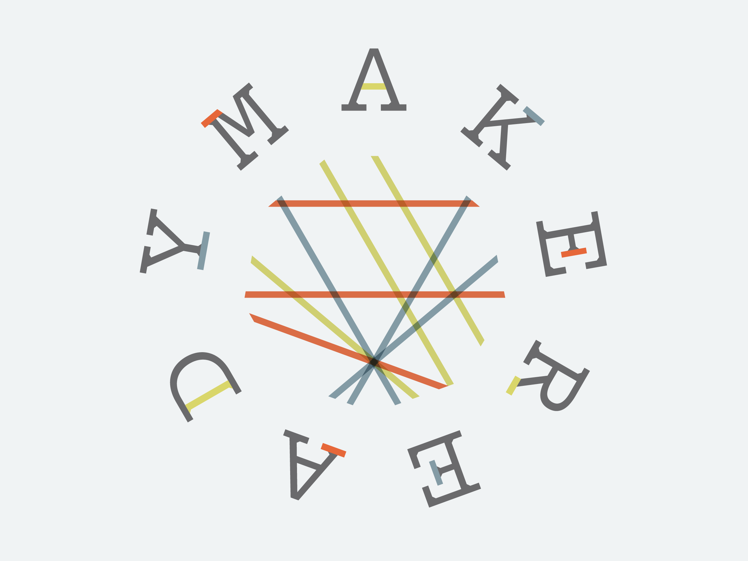
Explore typeface design through the development of a digital New Alphabet family founded on Wim Crouwel’s original specifications and intentions.
Work Flow
Focus on developing a New Alphabet family with at least three weights and three styles. Stick to Wim Crouwel’s original intentions: the type faces should abide by his basic grid, and should reproduce well on screen. Determine a bold weight with dimensions which allows for lighter weights that still meet the basic specifications of Crouwel’s original grid.
Outcome
The solution is a compromise between the want to develop a cohesive type family, while sticking as closely as possible to Crouwel’s original guidelines, and creating the best digital version(s) of the New Alphabet possible in the time provided. The resulting digital type family has 42 fonts spread over 5 unique styles.
A note from the great Wim Crouwel:
“I am very impressed by your work. Although the New Alphabet attracted much attention all over the world, until [now] nobody ever spent that much attention to my experiment. ... I am especially impressed by the consequent line you followed while you developed your large family [and] while you tried to follow my basic grid.”
42 Fonts
The solution is a cohesive type family with 42 fonts spread over 5 different styles.
FontLab Development
When I originally set out to work on this project, I intended to focus more heavily on hinting, so the cuts would look right on screen. However, after some research and an email dialogue with Peter Bil’ak – one of the world’s most knowledgeable type designers and type design professors – I decided to spend less time on hinting, and more time on developing variations. After all, if Peter Bil’ak tells his students not to worry about hinting, it is pretty safe to leave it alone.
